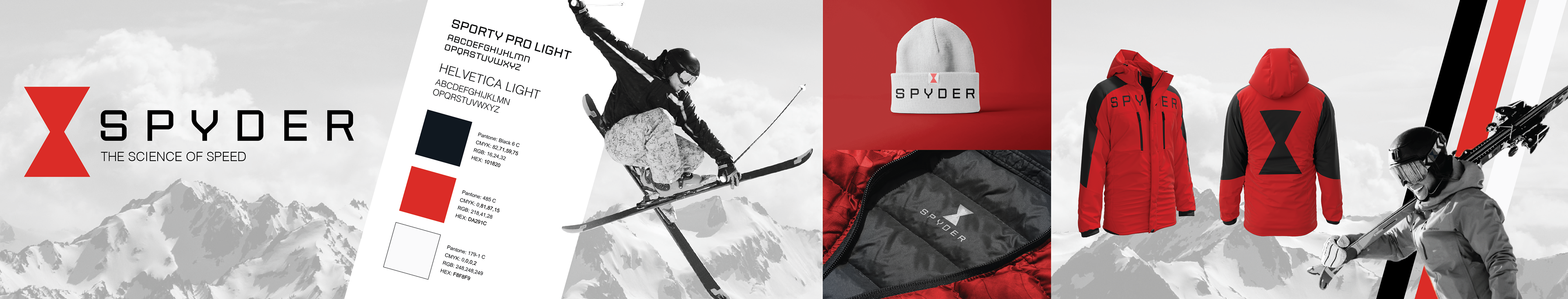
Brand Stylescape
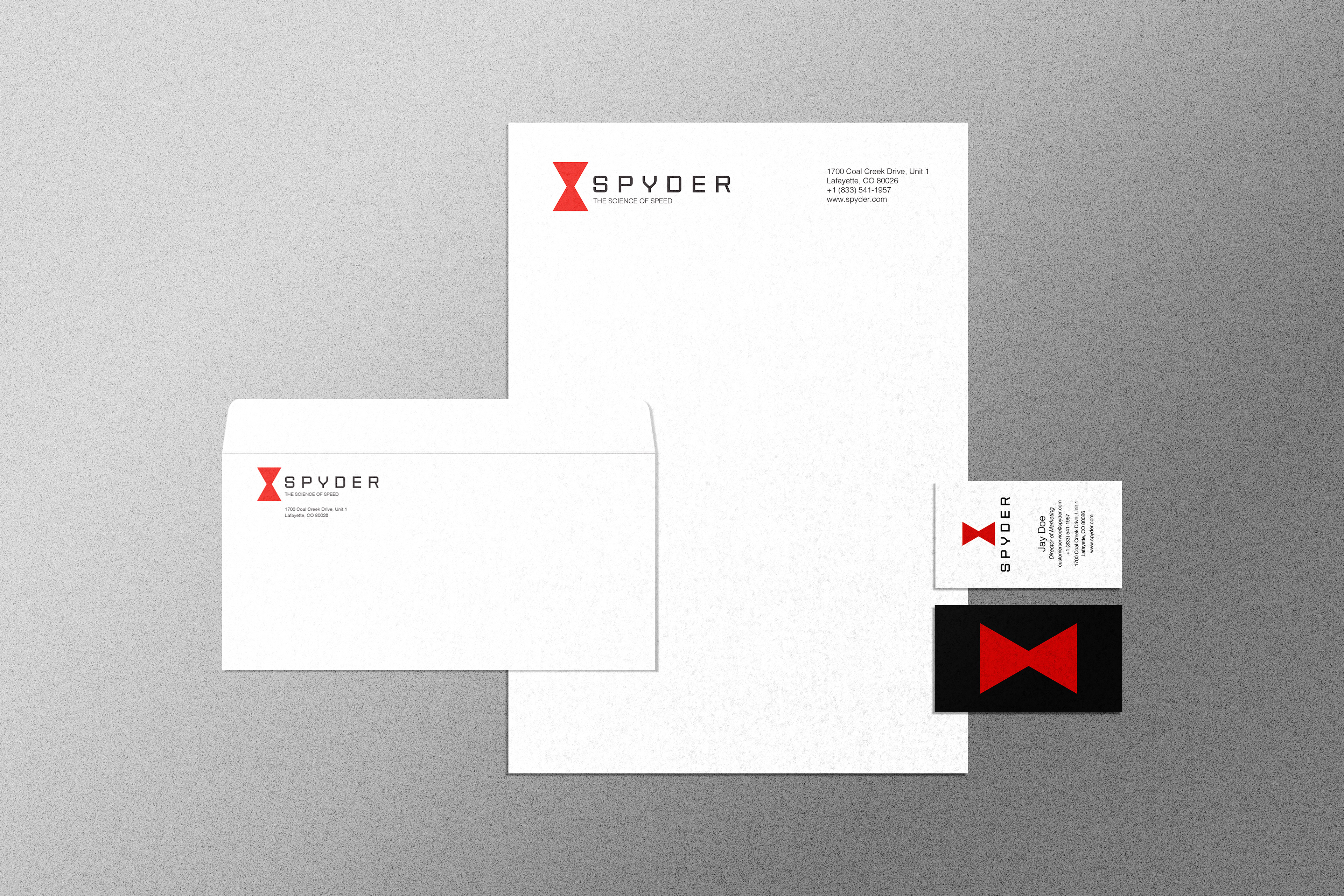
Stationary & Business Card Mockup
Design Processes
Sketches
Competitor Analysis
Mind Maps
Mood Boards
Refining Concepts
Style Guide
Mockups
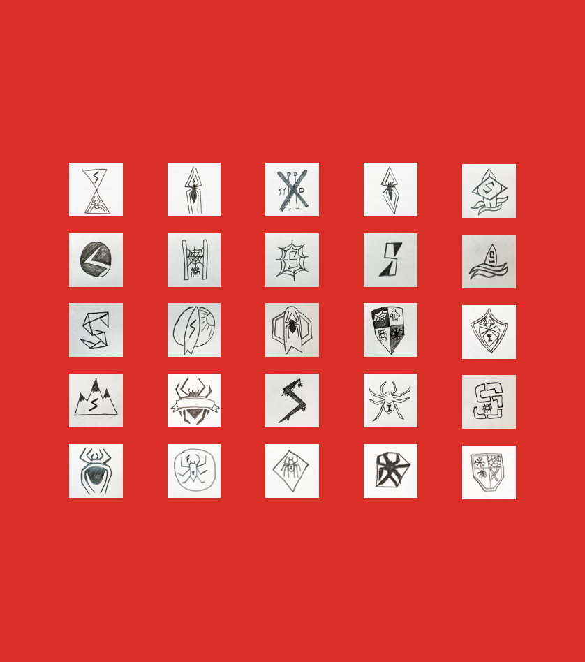
Sketches
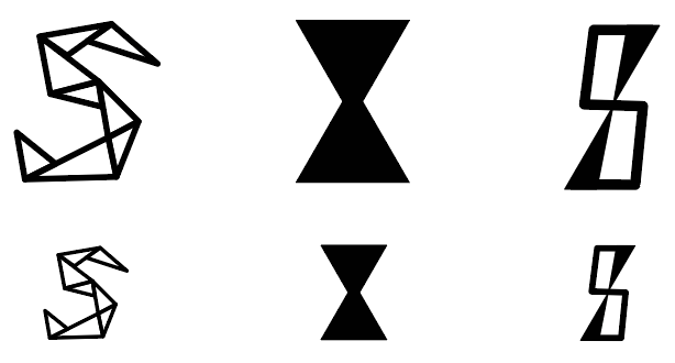
Digitalized Sketches
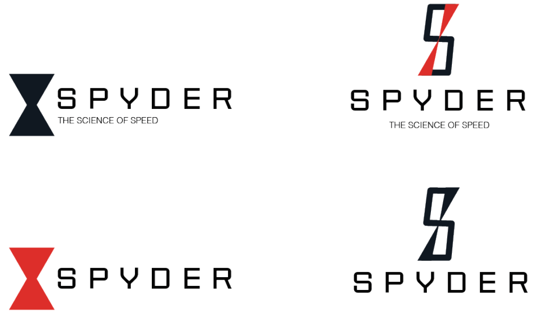
Refined Digital Logos

The existing brand identity for Spyder was recognized as inconsistent and outdated, no longer resonating with modern design trends or effectively communicating the brand's core message. The goal of this brand refresh project was to revitalize the company's visual identity, updating it to reflect a more contemporary and cohesive aesthetic while preserving the essence of what Spyder stands for. This included maintaining the brand’s core values and ensuring a seamless transition that would continue to resonate with existing customers while attracting a new, more diverse audience. The process involved a thorough analysis of the brand’s previous design elements, followed by a strategic update to the logo, color scheme, typography, and overall visual language. The result was a refreshed identity that successfully balanced modernization with consumer familiarity, reinforcing Spyder's position in the market while ensuring its values remained clear and consistent across all touchpoints.
Brand Stylescape
Stationary & Business Card Mockup
Refined Digital Logos